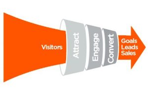
10 Rules For High Site Conversion: Is website conversion important? Anyone familiar with the web environment will answer this question in the affirmative. After all, the conversion is an indicator of the actual work of the site, calculated not relative to the total number of visits, but based on the manifestations of real user interest.
10 Rules For High Site Conversion
Conversion rates are usually referred to as the ratio of the number of real actions – sales, placing orders/subscriptions, registering on the site to the total volume of visits. That is, if 10 out of 1000 visitors make a purchase or place an order, the conversion is 1%. Why do I need conversion rates? It’s simple: even with successful search engine promotion, a site can be useless from monetization/revenue from sales if it does not have a good conversion.
And the volumes of 1-5% of the total traffic are considered normal indicators of site conversion. And it is precise to their achievement that one should strive.
Website Conversion: Methods for Achieving Goals
Why increase conversion? Of course, for the site to bring the expected results. For example, if the goal is to increase sales, place an order, register, it is worth paying attention to the motivation of visitors to switch to active actions. And to attract user attention to the discussion of materials or communication on the forum, there are other methods of influence.
So how to increase conversion?
1) Speed up the download
The golden rule “5 seconds” of loading a site does not lose relevance. A site with slow loading will never have a high conversion rate, not to mention traffic. A high number of user failures will invariably hinder the promotion of a resource in the issuance.
So is it worth it to lose visitors if the situation can be corrected? It is worth analyzing the work of the site, removing unnecessary elements and scripts, adapting images and video content to the smallest possible sizes, tracking the possible traffic overload due to receiving data from third-party sites.
2) Offer visitors what they need
Does the visitor spend too much time searching for the product/page he needs? Most likely, the conversion of such a site will be at zero. Let visitors and potential customers find the best deals in just one click.
Present a free information product for a newsletter subscription? Let visitors know about this from the first seconds of their stay on the site.
Do you offer a favorable price for a product or service? Place the appropriate banner on the main page. For greater clarity, you can select a special sector for special offers, periodically updating the posted information. The main thing is that the benefits of the proposal should be obvious from the very first seconds.
3) The rule of “one screen”
All the necessary information should fit into the framework of one screen (without scrolling). Often, not only duplicated navigation elements, but also important contact information is hidden in the basement of the site. And, if this information cannot be found at first glance, it is unlikely that the visitor wants to delve into the research. This circumstance should be taken into account in the process of developing a website design. And if the problem is already relevant – you can achieve the desired effect by optimizing the sizes of other elements and modules located on the pages of the site.
4) Focus on contacts
Want to increase call conversion? Place contact phones in a prominent place – in the header of the site. This will allow visitors to reduce decision-making time and increase the likelihood that a call will be made.
5) Are there any advantages? Do not hide them!
Ready to offer your customers something exclusive? Are you sure that you are superior to your competitors in all respects? So tell the visitor about this at the very beginning of your stay on the site.
By posting information about the availability of free delivery and service, gifts or discounts, you can increase customer loyalty by pushing them to perform the necessary actions.
6) Viewing rules
A typical visitor predictably browses the site: from the left to the center, with almost no attention to the right side of the pages, Pubg pc. That is why it is worth placing the most important information on the left side of the site’s header and in the central area, leaving the right column to place less relevant, but necessary information.
7) Regular visitor
Most website visitors come to its pages only once and never return. There can be many reasons for this. “Not hooked”, “there is no relevant information”, “they are not satisfied with the prices” – all this can be heard as a reason for refusing a second visit.
The only way to turn the tide, turn it to your advantage is to find a reason to continue communication. That is, if the visitor is not ready to make a purchase, it is necessary to provide him with an alternative, to interest him in a further visit.
And for this, you need to get contact information about a potential client. As working options, you can use sentences like: “Did not find the right one? Leave your e-mail, and we will notify you of the receipt of the goods, offering a good discount for loyalty “or” For registered users, special conditions/discounts are available “, etc.
8) The subtleties of communication
You can increase the loyalty of the audience, and with its conversion, using personal appeal. Replacing references to the company with information about consumer benefits, you can achieve the desired results in a short time.
 Promise a solution to specific problems, address targeted to the consumer of goods and services, and the conversion will increase.
9) Shorten the distance
The use of multimedia elements on the site allows you to interest a user audience that is not ready for a long study of textual information. A short video can reveal the merits of a product much more successfully than a dry exposition. And to show the “product face” with the help of video can be much more vivid than using photo content.
10) Use intuitive calls to action
10 Rules High Site Conversion: Bright buttons that replace part of the navigation elements or links are a good way to increase website conversion. A Pubg pc game on associations can lead even a doubting consumer to action. In this case, large images of people with whom the visitor tends to associate themselves work great.
HussaiN is a full-time professional blogger from India. He is passionate about content writing, tech enthusiasts, and computer technologies. Apart from content writing on the internet, he likes reading various tech magazines and several other blogs on the internet. Email ID: arrowtricks.pvt@gmail.com


0 Comments